 Canada

Workplace safety signs and meanings: how to read, place, and keep them effective
Clear safety communication reduces confusion, speeds up decision-making, and helps people act before small issues become incidents. This article explains workplace safety signs and meanings in practical terms you can use on the floor: how to interpret common messages and symbols, where to place signs so they’re actually seen, and how to keep them legible over time. Use the checklists to evaluate current signage and plan updates without guesswork.
How to interpret common safety signs
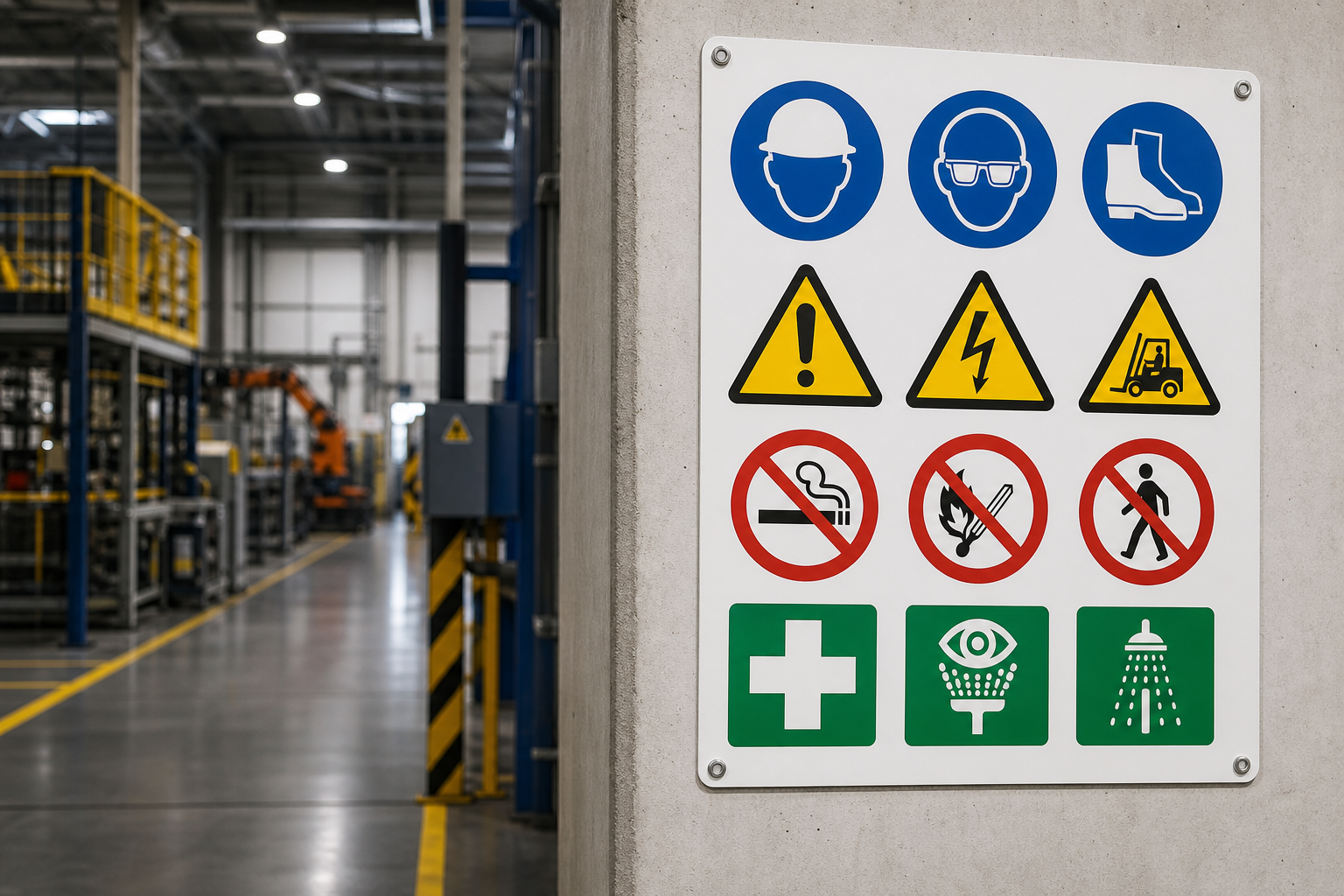
Across facilities, certain safety sign patterns show up again and again. While exact designs vary by employer, application, and standard, the underlying intent is consistent: alert, instruct, restrict, guide, or inform. Here are widely recognized categories and what they typically communicate:
- Hazard severity (signal words): These words indicate the level of risk when the message is ignored.
- Danger – The most serious level; immediate hazard that could cause severe injury or worse if not avoided.
- Warning – Significant hazard; serious injury is possible if the message is ignored.
- Caution – A potentially hazardous situation; minor or moderate injury is possible if precautions aren’t taken.
- Notice or Safety Instruction – General information, policies, or procedures that don’t relate directly to personal injury (for example, “Keep Aisles Clear”).
- Prohibition signs: Tell you what not to do. Examples: Entry Prohibited, No Smoking, or a symbol with a red slash through an activity.
- Mandatory action signs: Tell you what you must do. Examples: PPE Required, Eye Protection Required, Hand Protection Required, or Face Mask Required.
- Hazard alert signs: Call out a specific hazard. Examples: Slippery When Wet, Underground Cables, Caution Step Down, or Caution Open Slowly.
- Traffic and mobile equipment signs: Indicate vehicle movement, crossings, or restricted paths. Examples: Forklift Traffic, speed limits, and pedestrian lanes.
- Emergency and fire protection signage: Identify the location of emergency equipment and fire-related features. Examples: Fire Extinguisher, Emergency Exit, Fire Hose, Alarm Pull.
- Information and facility operation signs: Communicate housekeeping, process, or policy requirements. Examples: Keep Aisles Clear, Authorized Personnel Only, Report All Injuries.
When in doubt, combine the headline (signal word), the symbol, and the body text. Together, they answer three questions: What is the hazard or instruction? Why does it matter? What action should I take right now?
Color, shape, and symbols: what they typically convey
Even before you read a word, your brain picks up visual cues. While the exact palette or geometry can vary by facility and product line, these conventions are common in workplaces and help speed recognition:
- Red accents often flag prohibitions and fire-related equipment (for example, a red slash over a prohibited activity, or a red panel indicating the presence of an extinguisher).
- Yellow accents commonly draw attention to cautionary conditions like tripping hazards, steps, or slippery floors.
- Orange accents are frequently used to emphasize serious hazards that warrant a strong warning.
- Blue accents are commonly seen on required actions, such as mandatory PPE.
- Green and white often indicate helpful information, such as first aid or egress routes.
Symbols and pictograms reduce language barriers and improve quick recognition. For example, a hard hat icon indicates head protection; goggles suggest eye protection; a hand with a glove implies hand protection; a flame icon points to fire hazards or equipment; a person slipping warns of a slick surface. Where space allows, short, plain-language text below the symbol reinforces the meaning and action.
Tip: Keep symbols consistent across the site. Mixing styles or icon sets can slow recognition and cause hesitation in fast-moving areas.
Placement, size, and legibility: a practical checklist
Signs can be technically correct yet practically invisible. Use this checklist to decide where a message needs to live and how large and legible it should be.
- Line of sight: Place the sign where a person will naturally look when approaching the hazard or decision point. For doors and gates, position at eye level on the approach side.
- Approach distance: Size the text and symbol so they’re readable from the typical approach distance. Long aisles, vehicle routes, and high bays call for larger panels.
- Competing visuals: Avoid clutter. Too many signs in one spot dilute all of them. If several instructions are needed, consider a structured panel that groups related messages logically.
- Lighting and glare: Check visibility in real conditions. Overhead lights, windows, and glossy surfaces can cause reflections that hide critical words or icons.
- Orientation and height: Mount at consistent heights so crews build habits. For floor-level hazards like steps, pair a wall sign with floor or stair-edge markings.
- Durability and environment: Moisture, chemicals, UV exposure, and abrasion degrade materials over time. Use materials rated for the environment, especially outdoors or in washdown and chemical areas.
- Language and literacy: Favor clear icons and short phrases. If your workforce is multilingual, consider bilingual or symbol-led designs to reduce reliance on long text.
- Workflow alignment: Place signs where the decision is made. For instance, “PPE Required” should appear at the zone boundary—not buried deep inside the area where it’s too late to gear up.
Pipe identification and fire protection contexts
Two areas where clarity is especially important are piping systems and fire protection, because messages must be understood quickly in both routine and emergency conditions.
- Piping identification: Markers that clearly state contents and flow direction help teams trace energy and material paths, isolate lines, and respond to leaks. Place markers where lines change direction, enter or leave equipment, or cross walkways. Avoid placement where labels are hidden behind insulation, guards, or cable trays.
- Fire protection signage: Fire extinguishers, hose stations, pull alarms, and fire doors should be easy to find from a distance. Supplement local identification with overhead or high-mounted markers in areas with tall racking, stacked inventory, or frequent obstructions.
For both contexts, repeat information at intervals so that if one view is blocked, the next remains visible. Pair words with clear symbols to reduce lookup time during a response.
Training: turning signs into action
Signs only help when people understand and trust them. Reinforce messages with short, recurring training touches:
- Orientation walkthroughs: Introduce new team members to critical zones and explain the meaning of the most common signs they’ll see daily, such as PPE Required, Forklift Traffic, and Keep Aisles Clear.
- Micro-drills: Combine a five-minute reminder with a quick visual check. Example: On a rainy day, point out Slippery When Wet signs near entrances and confirm mats are in place.
- Toolbox talks: Rotate a single sign type each week. Explain what it means, where it should appear, and what to do if it’s missing or damaged.
- Feedback loop: Encourage workers to report unclear or conflicting messages. Often, the best improvements come from the people who walk the route every day.
Keep instructions consistent across media. If a sign says “Eye Protection Required,” ensure the written procedure and training reinforce the same wording and action. Consistency builds recognition and reduces debate during critical moments.
Inspection and maintenance: keeping messages legible
Environmental wear, equipment moves, and process changes can quietly turn a good sign plan into a confusing one. A light, recurring maintenance rhythm preserves clarity:
- Monthly visual sweep: Walk the main routes and production cells. Look for fading, peeling, impact damage, obstructed lines of sight, or signs covered by temporary materials.
- After-change checks: Any time you re-route traffic, add a guard, move racking, or install a new machine, verify that nearby signs are still visible and accurate.
- Environmental hotspots: Prioritize wet zones, washdown areas, outdoor locations, and spots with solvent exposure. These areas typically age signage faster.
- Floor and aisle markings: High-traffic floors and corners scuff quickly. Pair durable floor tape or paint with upright signage for redundancy.
- Standardize replacements: When you replace, match the same pictograms and phrasing used elsewhere so visual language stays uniform across the site.
Document the sign inventory by zone with photos. This makes it easy to spot what changed during the next audit and to order exact replacements.
A quick field checklist for workplace safety signs and meanings
Use this one-page mindset while walking your facility. If you answer “no” to any item, plan a fix.
- Meaning: Can a first-time visitor understand the sign’s instruction or hazard without help?
- Action: Does the sign clearly tell someone what to do (or not do) right now?
- Priority: Are the most serious hazards highlighted where people first encounter them?
- Placement: Is the message visible before someone commits to the action (e.g., before entering a PPE zone)?
- Distance: Is the text legible from the typical approach distance?
- Clutter: Are there too many messages fighting for attention in one spot?
- Consistency: Do symbols, colors, and phrasing match others around the site?
- Condition: Is the sign free of fading, peeling, glare, or obstruction?
- Redundancy: For critical items (exits, fire protection), is there a second view if the first is blocked?
- Recency: Does the sign reflect the current process, route, or equipment status?
FAQ: workplace safety signs and meanings
What do “Danger,” “Warning,” and “Caution” each imply?
They communicate increasing levels of risk if the instruction is ignored. “Danger” indicates the highest level and calls for immediate attention. “Warning” addresses significant hazards where serious injury is possible. “Caution” flags conditions where minor or moderate injury may result without proper care. Treat these as prioritization cues: the stronger the word, the faster and more carefully you should act.
What does a “PPE Required” sign mean in practice?
It tells you that specific protective gear must be worn before entering or working in the area. Common examples include hard hats, safety goggles, face shields, gloves, hearing protection, or respiratory protection. Look for icons that specify which item is required (for example, a goggles symbol for eye protection). If you are unsure which PPE is needed, stop and confirm before entering.
How are prohibition and mandatory signs different?
Prohibition signs tell you what not to do (for example, no entry, no smoking, or do not operate). Mandatory signs instruct you to take a required action (such as wear eye protection or keep aisles clear). Both are prescriptive, but one halts unsafe behaviors while the other ensures protective actions happen.
How often should faded or damaged signs be replaced?
Replace any sign as soon as it’s no longer clearly legible from its intended viewing distance or when the symbol or text is obscured, regardless of age. Environmental exposure, cleaning, and impacts can accelerate wear. Regular walkthroughs help you catch degradation before it undermines recognition.
What’s the best way to place “Forklift Traffic” or other mobile equipment signs?
Position them ahead of intersections, blind corners, and pedestrian crossings so walkers and drivers see them before a potential conflict. In noisy or busy areas, supplement wall signs with floor markings or overhead indicators to extend visibility.
Important note
This article is for general informational purposes. For specific compliance obligations and site policies, consult your employer’s procedures and a qualified safety professional.