 Canada

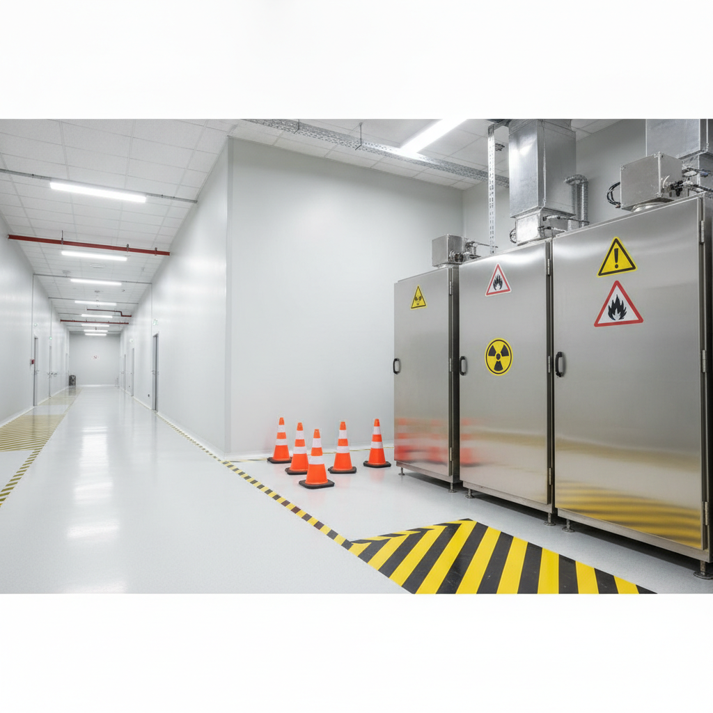
In industrial safety, a warning sign is a visual cue that alerts people to a potential hazard that could cause injury if not avoided. It uses clear symbols and colors to prompt caution before harm occurs. In the USA, consistent warning graphics help teams act fast, improve compliance, and prevent incidents.
By Dante de Felice • Last updated: July 3, 2026
Start Here: Quick Overview and Table of Contents
This guide explains what warning signs are, why they matter, and how to design, place, and maintain them for safety and compliance. Use the table of contents to jump to definitions, standards, types, best practices, tools, examples, and FAQs tailored to USA workplaces that rely on industrial signage.
Use this complete guide to plan, purchase, and maintain high-visibility industrial signage. VisionMarker specializes in ANSI‑certified signs, pipe markers, labels, and fire protection signage built for UV, moisture, and chemical resistance—ideal for demanding facilities across the USA.
- What Is a Warning Sign?
- Why Warning Signs Matter
- How a Warning Sign System Works
- Types of Warning Signs and Markings
- Standards and Compliance Snapshot
- Best Practices: Design, Placement, Durability
- Tools, Materials, and Resources
- Case Studies and Real‑World Examples
- Frequently Asked Questions
- Key Takeaways
- Conclusion and Next Steps
What Is a Warning Sign?
A warning sign communicates a medium‑level hazard that can cause serious injury if ignored. It uses a defined signal word, color panel, and symbol to trigger caution and a specific action. In industrial settings, consistent design improves recognition within seconds, even under stress or low‑light conditions.
Warning signs are one category within a broader safety communication system that also includes Danger, Caution, and Notice messages. In practice, a warning sign draws attention to elevated risk—think energized machinery, hot surfaces, forklift aisles, or partial guard removal. The goal is fast hazard recognition and a clear next step.
Core elements you’ll see on compliant warning signs
- Signal word panel: The signal word (e.g., Warning) paired with a color panel that stands out from background equipment and walls.
- Safety symbol: A standardized pictogram that conveys the hazard or required behavior across language barriers.
- Consequence and action text: A brief, specific description of the risk and how to avoid it in 1–2 lines.
- Layout and contrast: High contrast fields and adequate negative space for legibility at distance.
As a rule of thumb, plan letter height with a viewing‑distance factor (for example, about 1 inch of text height for every 25 feet of viewing distance). Use durable substrates—aluminum, rigid plastic, or high‑tack label stock—matched to heat, chemicals, UV, and washdowns.
To deepen your team’s understanding of the symbol system, see our guide to safety symbols explained, which pairs icons with recommended actions for faster recognition.
Why Warning Signs Matter
Warning signs reduce reaction time, reinforce safe behavior, and help standardize risk communication across shifts. Consistent colors, symbols, and wording let workers process hazards in 1–3 seconds—enough time to stop, look, and take the right action before an incident escalates.
Here’s the thing: most near‑misses are pattern‑recognition problems. When environments look different from zone to zone, hazard cues get missed. A consistent warning sign system creates a predictable visual language so teams can scan, decide, and move safely.
Benefits you can measure on the floor
- Faster visual processing: Standard layouts cut the “what am I looking at?” delay, which is often only a few seconds in busy aisles.
- Lower variability across shifts: Clear signage works the same for new hires, contractors, and seasoned operators.
- Easier audits: Documented placement rules and durable materials simplify inspections and corrective actions.
- Better barrier‑free messaging: Symbols carry across languages and literacy levels, which is critical in diverse USA facilities.
When you standardize formats and placements, you also make maintenance predictable. That cuts unplanned downtime from improvised labeling and reduces the odds that improvised tags will contradict permanent signs.
If you’re planning a sitewide update, our marking systems safety guide outlines a step‑by‑step approach you can reuse across multiple buildings or business units.
How a Warning Sign System Works
An effective system follows a lifecycle: assess hazards, select the right sign type, design for distance and contrast, place at decision points, and maintain on a defined interval. This cycle ensures hazards remain visible, legible, and aligned with current processes and equipment.
In our experience, the easiest way to scale is to treat signage like any other safety control—document the spec, then monitor performance. Start with a standardized palette and symbol library, then lock in mounting heights and angles for repeatable installs.
Five practical phases you can repeat
- Hazard assessment: Walk the process. Capture equipment states (startup, operation, cleaning, shutdown) and people/machine interfaces.
- Selection: Map each risk to a category (Danger/Warning/Caution/Notice). Avoid mixing categories within the same line of sight.
- Design: Confirm symbol choice, signal word, consequence/action text, and viewing distance. Keep copy to two lines where possible.
- Placement: Mount between about 5–7 feet to hit typical sightlines. Angle signs toward approach paths; avoid obstructions.
- Maintenance: Inspect on a set cadence—monthly visual checks, plus quarterly deep inspections for UV/chemical wear.
As processes change, update copy and symbol selection. Retire temporary tags quickly so they don’t dilute the authority of permanent safety signs.
Types of Warning Signs and Markings
Warning signs span equipment hazards, traffic movement, environmental risks, and required PPE. Common categories include energized machinery, hot surfaces, forklift aisles, chemical splash, slip hazards, restricted access, and underground utilities. Pair panel signs with floor tape, barricades, and pipe markers for a complete visual system.
VisionMarker supports USA facilities with ANSI‑certified safety signs, durable labels and stickers, and high‑visibility floor and barricade markings designed for harsh environments. Below are frequent use cases we help teams solve.
Frequent categories and real‑world placements
- PPE required: Eye/face/hand protection zones at grinders, chemical stations, and battery rooms.
- Forklift traffic: Intersection and blind‑corner warnings; pair with floor arrows and mirrors.
- Slippery when wet: Near washdown areas, docks, and chilled‑water leaks.
- Hot surface/High temperature: Dryers, ovens, heaters, and recently welded parts.
- Underground cables/Utilities: Excavation sites and maintenance corridors.
- Entry prohibited/Restricted: Machine cages, energized cabinets, construction zones.
- Lockout for safety: At energy‑isolation points during maintenance.
For symbol clarity and fast ordering, browse our dedicated category of warning signs designed for rapid deployment and long service life.
Standards and Compliance Snapshot
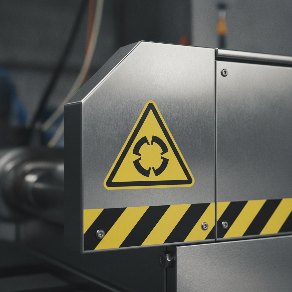
Align your warning signs with recognized North American standards. Use standardized signal words and pictograms, size text for viewing distance, and select durable materials. Consistency across ANSI, NFPA symbols, and pipe marking rules improves audits and reduces confusion in USA facilities.
VisionMarker emphasizes compliance across multiple frameworks and materials engineered for UV, moisture, and chemicals. That means your signage program can satisfy internal EHS requirements while aligning with recognized North American practices.
Where warning signs fit in the standards landscape
- ANSI safety sign formats: Standardized layouts, color panels, and symbol usage create instant recognition. See our ANSI Z535 quick guide for a practical overview.
- NFPA 170 symbols: Fire safety pictograms for extinguishers, alarms, exits, and more—often paired with equipment labels in the same sightline. Explore fire safety products that use consistent iconography.
- ASME A13.1 pipe markers: Pipe contents and flow arrows complement panel signs so workers can trace hazards quickly. See how signs and markers work together in our hazard markings guide.
If you maintain electrical equipment or structural areas where sign mounts must shift during upgrades, broader safety context can help. For example, design considerations for electrical risk controls are discussed in this industrial electrical guide. Structural retrofit work also affects sign mounts and sightlines; for background, see these structural steel framing notes and this ASTM A706 overview.
Best Practices: Design, Placement, Durability
Design for speed and clarity. Use standardized symbols and signal words, size copy for distance, mount at eye level on approach, and choose materials that outlast UV, moisture, and chemicals. Audit quarterly and replace degraded signs before legibility drops below safe thresholds.
Design rules that improve recognition
- Use the right category: Don’t dilute the “Warning” category—reserve it for serious hazards that aren’t immediately life‑threatening.
- Write for action: “Burn hazard—wear heat‑resistant gloves” beats vague phrasing. Keep it to one short sentence when possible.
- Plan for distance: Treat about 1 inch of letter height per 25 feet of viewing distance as a planning benchmark.
- Respect contrast: High‑contrast backgrounds and uncluttered fields reduce misreads in dim or glare‑heavy areas.
Placement that matches how people move
- Decision points first: Place signs where the reader must choose an action—before the pinch point, not at it.
- Eye‑level mounting: Aim for roughly 5–7 feet from floor to centerline; adjust for seated operators or elevated platforms.
- Angle toward approach: A slight tilt toward the typical approach path increases legibility and reduces reflections.
- Repetition matters: For long aisles (e.g., 100 feet), repeat signage every 30–50 feet and at each intersecting lane.
Durability choices that pay off
- Match material to environment: Use rigid plastic or aluminum for impacts; vinyl or polyester labels for curved or small‑radius surfaces.
- Chemical and UV resistance: Choose inks and laminates built for regular washdowns, solvents, and sun exposure.
- Hardware and adhesion: On rough walls, mechanical fasteners beat adhesives; on enclosures, high‑tack adhesives avoid drilling.
For a fast way to standardize categories and formats, use our OSHA warning signs overview alongside the ANSI Z535 quick guide and category‑specific warning signs.
| Signal Word | Hazard Level | Color Panel | Typical Use | Example Message |
|---|---|---|---|---|
| Danger | Immediate, severe | High‑contrast panel | Life‑threatening hazards | Arc flash—authorized personnel only |
| Warning | Serious, not immediate | Attention‑grabbing panel | Hot surfaces, moving parts | Crush hazard—keep hands clear |
| Caution | Moderate injury possible | Noticeable panel | Trip, minor pinch points | Watch your step—uneven floor |
| Notice | Non‑injury information | Informational panel | Process info, maintenance | Keep door closed after use |
Free layout check: Share two photos of a problem area and your target message. We’ll confirm symbol choice, text length, material, and mounting suggestions so you can deploy with confidence. Start with our category of warning signs and we’ll help you finalize the spec.
Tools, Materials, and Resources
Build your program with standardized symbol libraries, durable substrates, and a documented spec. Combine panel signs, labels, floor markings, and pipe markers. Use a simple audit checklist and a 90‑day review cycle to keep visibility and legibility high across shifts.
Core components from VisionMarker
- ANSI‑certified panel signs: Ready‑to‑deploy formats for equipment, traffic, and environmental hazards.
- Labels & stickers: High‑tack options for enclosures, lockout points, and tight‑radius surfaces.
- Fire protection signage: Consistent iconography for extinguishers, alarms, and egress devices—see fire safety products.
- Pipe markers: Align with process safety visuals so workers can trace contents and flow alongside warnings; details in our hazard markings guide.
Simple tools that speed installs
- Measuring and angle tools: A digital level and laser measure standardize mounting height and tilt.
- Surface prep kit: Degreaser, lint‑free wipes, and abrasion pads help adhesives bond on coated metal and plastics.
- Photo documentation: A quick phone photo log keeps audit trails clear and repeatable.
For broader context on risk controls around electrical work, see this industrial electrical guide. While not a signage standard, it offers helpful background when planning warning sign placement near panels or MCC rooms that may change over time.
Case Studies and Real‑World Examples
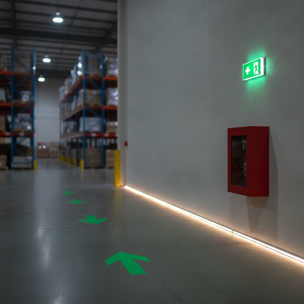
Standardizing warning signs across lines reduces confusion and speeds reactions. In practice, teams see fewer mixed messages, faster audits, and better contractor compliance. Here are short scenarios showing how consistent formats, materials, and placements delivered measurable improvements.
Battery room PPE and eyewash access
- Problem: Mixed, aging signs around a battery room led to inconsistent PPE use and blocked eyewash access.
- Action: Replaced ad‑hoc postings with standardized warning signs and floor icons; added high‑tack labels on enclosures.
- Result: Clear sightlines and consistent messages reduced blocked access observations in follow‑up checks.
Forklift aisles and pedestrian crossings
- Problem: Pedestrian near‑misses at intersections with limited visibility.
- Action: Installed repeating warning panels at 30–40 foot intervals; added mirrors and floor arrows to confirm right‑of‑way.
- Result: Operators reported earlier detection and smoother yields at crossings during the next cycle count period.
Fabrication cells with hot surface hazards
- Problem: Inconsistent labels on recently welded parts caused avoidable contact burns.
- Action: Deployed durable warning labels near handling points; standardized glove pictograms and action text.
- Result: Supervisors observed increased glove adherence and a drop in first‑aid heat contact cases during the next review period.
For step‑by‑step symbol decisions and formatting tips used in these examples, see our safety symbols guide and category page for warning signs.
Frequently Asked Questions
Get direct, practical answers to the most common warning sign questions. These responses focus on design, placement, maintenance, and how signs integrate with labels, floor tape, and pipe markers in USA industrial facilities.
What’s the difference between Danger, Warning, and Caution?
Use Danger for immediate, severe hazards; Warning for serious but not immediate risks; and Caution for moderate hazards. Keep categories consistent within a line of sight so readers don’t have to guess the severity while deciding what to do next.
How high should I mount a warning sign?
Aim for the centerline between about 5 and 7 feet from the finished floor. Adjust for seated operators or elevated work platforms. Angle the sign toward the approach path and avoid glare sources that can wash out contrast in bright areas.
How often should warning signs be inspected?
Do quick visual checks monthly and deeper reviews quarterly. Look for fading, abrasion, chemical damage, and obstruction by stacked materials. Replace signs before legibility drops, and remove temporary tags that could conflict with permanent messaging.
What materials last longest in harsh environments?
Use aluminum or rigid plastic panels where impact is possible, and high‑tack, industrial‑grade labels on enclosures or curved surfaces. Choose inks and laminates designed for UV exposure, solvents, and washdowns to maintain color fidelity and contrast over time.
Key Takeaways
Treat warning signs as a system: standardize formats, place at decision points, and maintain on a schedule. Pair panel signs with labels, floor tape, and pipe markers. Align with recognized standards and choose durable materials for long‑term visibility in USA facilities.
- Design for distance, contrast, and immediate action.
- Place signs at approach points and repeat along long paths.
- Use durable substrates and protective laminates matched to the environment.
- Audit quarterly; replace before legibility degrades.
- Leverage VisionMarker’s ANSI Z535 guide and fire safety products to standardize faster.
Conclusion and Next Steps
Warning signs only work when they’re designed for speed and maintained like any other control. Standardize formats, pick durable materials, and document your placement rules. The result is faster recognition, cleaner audits, and a safer, more predictable workplace across USA facilities.
Ready to tighten your signage program? Start with the right formats in our warning signs category, align layouts using the ANSI Z535 quick guide, and extend coverage using the hazard markings guide. If you need help, our team will review photos and recommend a materials plan tailored to your environment.