Canada
A prohibited area sign is a safety and security sign that clearly communicates “no entry” to unauthorized people. In U.S. industrial and commercial facilities, it’s used to restrict access to hazardous, sensitive, or high-value zones. Consistent design, correct wording or symbols, and strategic placement reduce incidents and support compliance.
By VisionMarker — Last updated: June 10, 2026
At a Glance: Overview
Prohibited area signs prevent unauthorized entry into risky or sensitive zones. Use ANSI-aligned colors/signal words, NFPA 170 symbols where applicable, and place at every normal approach path. Durable, weatherable materials and routine inspections keep messages legible and enforceable.
VisionMarker serves facility managers and EHS leaders across the USA with ANSI-certified industrial signage engineered for harsh environments. This complete guide explains prohibited area sign fundamentals, relevant standards, field deployment, and maintenance—plus practical examples drawn from real facility scenarios.
- What a prohibited area sign is and when to use it
- How it fits with ANSI Z535 design conventions and NFPA 170 symbols
- Where to place signs for maximum visibility and compliance
- Durable material choices that withstand UV, moisture, and chemicals
- Checklists for audits, replacements, and seasonal upkeep
Table of contents
- What is a Prohibited Area Sign?
- Why Prohibited Area Signs Matter
- How Prohibited Area Signs Work
- Types of Restricted-Access Signage
- Best Practices for Selection, Placement, and Care
- Tools, Materials, and Resources
- Case Studies and Examples
- FAQ
- Conclusion and Next Steps
- Related Articles
What is a Prohibited Area Sign?
A prohibited area sign communicates that entry is not allowed without proper authorization. In U.S. workplaces, it aligns with ANSI Z535 formats and may use NFPA 170 symbols. These signs appear at perimeter points, doors, and approaches to ensure people recognize boundaries before crossing them.
In practice, a prohibited area sign tells people, in plain language or standardized pictograms, that the space beyond is off-limits. This can cover energized equipment rooms, robotics cells, chemical storage, server rooms, construction zones, and other sensitive areas.
- Core purpose: Deny entry to keep people safe and protect assets or processes.
- Design components: Signal word (e.g., Danger/Warning when appropriate), color bands, symbol, concise message.
- Formats: Rigid aluminum or plastic plaques, decals for doors, fence-mounted panels, and magnet-backed panels for temporary needs.
- Standards context: ANSI Z535 influences color/signal-word conventions; NFPA 170 offers pictorial symbols; facilities often harmonize with internal security policies.
VisionMarker supplies category-specific products that safety teams can implement immediately. If you need a ready-to-post panel, start with our Entry Prohibited sign to mark restricted thresholds while you finalize long-term access control measures.
Why Prohibited Area Signs Matter
Restricted-entry signs reduce exposure to hazards, protect sensitive processes, and clarify legal obligations. Consistent messaging lowers confusion at shift change, during contractor work, and in emergencies—improving safety performance and helping demonstrate due diligence.
Clear boundaries prevent near-misses from becoming incidents. When workers, visitors, and contractors know where they may not go, they avoid energized gear, moving vehicles, hazardous atmospheres, and security-only zones. In our experience supporting U.S. plants and warehouses, the quickest safety wins often come from improving wayfinding and boundary markers.
- Human factors: People process color and symbols in milliseconds. Standardized signs leverage that reflex.
- Operational stability: Restricted zones reduce accidental shutdowns and process contamination.
- Emergency clarity: When alarms sound, conspicuous perimeter signs guide evacuation and keep crowds from flowing into danger.
- Documentation value: Up-to-date signage supports training, audits, and incident investigations.
Safety teams also pair signage with lighting and visual controls to reinforce behavior. For context on complementing visibility tools, this night-vision guide discusses how lighting aids recognition in low-light environments—useful when prohibited areas are outdoors or in dim corridors.
How Prohibited Area Signs Work
They combine signal words, colors, and symbols to trigger fast recognition and compliance. Placed at decision points on every approach path, they set expectations before someone crosses a threshold. Durable construction keeps messages legible under weather, UV, moisture, and chemical exposure.
Here’s the mechanism in plain terms: people make micro-decisions as they move. If a sign appears where a path converges on a door, gate, or access aisle, the brain processes the graphic and color instantly, then reads the message if needed. That sequence—symbol first, words second—keeps traffic flowing safely.
- Decision-point placement: Mount signs where a person chooses between turning away or proceeding.
- Redundancy: Use both symbol-only and symbol+text formats in complex areas.
- Sightline engineering: Size and mount height should meet typical approach distances and angles.
- Material endurance: Use UV-stable inks and weatherable substrates so colors stay accurate and enforceable.
We’ve found that pairing signage with physical controls (barriers, locks) and procedural controls (permits, escorts) strengthens compliance. Signage is the clear, 24/7 communication layer that makes everything else work as intended.
Types of Restricted-Access Signage
Use different restricted-entry formats for different risks: Danger for immediate severe hazards, Warning for significant risks, Caution for moderate hazards, and symbol-only for universal recognition. Match the format to the credible worst-case outcome and your policy.
While the everyday phrase is “prohibited area sign,” practitioners choose from several formats to fit the risk profile and context. Below is a practical comparison to help standardize your choices across sites.
| Format | Use when… | Typical placements |
|---|---|---|
| Danger (Restricted/Keep Out) | Credible risk of severe injury or death on entry | High-voltage rooms, energized equipment bays, explosive atmospheres |
| Warning (Authorized Personnel Only) | Serious hazards require training/PPE/lockout before entry | Maintenance shops, paint booths, hot work areas |
| Caution (No Unauthorized Entry) | Moderate hazards or process sensitivity justify control | Robotics cells during setup, light-chem storage, testing labs |
| Symbol-only (NFPA 170 pictograms) | Multilingual or fast-recognition needs dominate | Exterior gates, mixed-contractor projects, shared corridors |
To standardize restricted-entry messaging in your facility:
- For severe hazards, browse our Danger sign category and align to your LOTO and arc-flash boundaries.
- For significant risks and training-gated areas, select from Warning signs that communicate authorization rules.
- For general keep-out messaging around moderate hazards, see our Caution sign collection.
Where symbol consistency is critical, facilities add pictorial panels that harmonize with internal training. See VisionMarker’s NFPA-influenced graphics such as this warning symbol panel used to anchor visual language across sites.
Best Practices for Selection, Placement, and Care
Choose the right format, size, and substrate; place signs at every approach; and maintain legibility. Document a simple inspection cycle, swap damaged panels immediately, and reinforce with barriers, lighting, and floor markings for a complete visual control system.
Selection
- Match risk to signal word: Use stronger formats as hazard severity rises.
- Right size, right distance: Ensure character height and symbol size are readable at typical approach distances.
- Substrate matters: Choose aluminum for outdoor fences, rigid plastic for interiors, and adhesive vinyl for doors or equipment.
- Hardware and tamper-resistance: Use stainless fasteners and security heads outdoors and in public-facing zones.
Placement
- Every approach path: Install at primary entrances and secondary routes (service doors, side gates).
- Height and angle: Keep in the primary field of view (roughly 5–6 ft to center where possible) and avoid obstructions.
- Lighting and contrast: Add task lighting or reflective elements for night visibility; contrast with backgrounds.
- Combine with floor graphics: Use hazard stripes and arrows to reinforce turning points before the boundary.
Care and inspection
- Quarterly visual checks: Look for fading, abrasion, vandalism, or corrosion; replace at first sign of illegibility.
- Post-event review: After maintenance outages or storms, re-verify sightlines and mounting integrity.
- Documentation: Track locations and replacement dates to show due diligence during audits.
- Seasonal prep: Before winter or hurricane seasons, confirm fixings, clear vegetation, and verify reflectivity where needed.
Need a quick compliance check? Our team reviews layouts, suggests formats, and points you to ready-to-ship panels. Explore our restricted-entry options starting with the Entry Prohibited sign.
Local considerations for your area
- Align signage with U.S. holidays and shutdowns when contractor traffic spikes; post temporary restricted-entry decals on alternate routes.
- Account for regional weather: in snowy or coastal zones, elevate signs and use corrosion-resistant hardware to preserve legibility year-round.
- For multi-shift operations, pair signs with beacon lights at doors so night crews see the boundary even when ambient light is low.

Tools, Materials, and Resources
Build a durable visual boundary system using UV-stable panels, reflective films, tamper-resistant hardware, and companion markings. Pair with simple inspection logs and training slides so your workforce recognizes and respects restricted-entry controls.
VisionMarker’s catalog is engineered for harsh industrial use—UV, moisture, and chemical exposure. Safety teams often combine rigid keep-out panels with decals on doors, barrier arms, and mobile equipment to keep the message visible from any approach angle.
- Rigid panels: Aluminum for perimeter fences; rigid plastic for interiors.
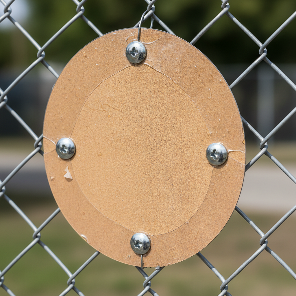
- Adhesive decals: Doors, machine guards, and temporary partitions.
- Hardware kits: Stainless bolts, security heads, backing plates for chain-link.
- Visual reinforcements: Floor hazard stripes and arrows at approach aisles.
- Pictogram sets: NFPA-influenced symbols to standardize visuals across departments (e.g., warning symbol panel).
Complementary safety resources can spark ideas for your broader program. This concise electrical safety guide illustrates how layered controls (signage, training, and equipment) reinforce one another. On construction projects, restricted zones help protect staging areas—see this overview of prefabricated rebar cages as an example of operations that typically require controlled access.
Case Studies and Examples
Consistent restricted-entry signage prevents near-misses, speeds orientation for contractors, and simplifies audits. These short scenarios show how facilities in different sectors standardize messages, improve sightlines, and document inspections for stronger safety culture.
1) Distribution warehouse: forklift aisles and battery room
A national warehouse network mapped entry points to forklift charge rooms and tool cribs. They mounted rigid keep-out panels at eye level and added floor stripes at turning aisles. Outcome: fewer wrong-door attempts and smoother contractor orientations at shift change.
- Sign choice: “Authorized Personnel Only” at doors; symbol-only panels on side approaches.
- Reinforcement: Red beacons energized during charge cycles; reflective stripes for low light.
- Tip: Audit during active traffic—signs that work on paper can vanish behind stacked pallets.
2) Industrial plant: robotics cell during setup
Maintenance needed frequent in/out access while robots were homed. The team posted magnet-backed panels during setup, switching to rigid mounts after commissioning. This flexible approach kept messaging accurate without drilling new holes mid-project.
- Sign choice: Caution-level keep-out during setup, upgraded to Warning during cycle tests.
- Reinforcement: Floor arrows steering around the cell; escort policy for visitors.
- Tip: Temporary signs should be equally legible and durable while in service.
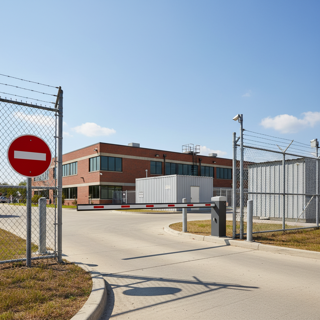
3) Utilities substation: perimeter control
Utilities managers needed symbol recognition for mixed-language contractors. They selected symbol-forward “no entry” panels on every fence run-out and at gates. Pairing signage with amber perimeter lights improved night visibility near roads.
- Sign choice: Symbol-only with a prominent universal “no entry” graphic on fences.
- Reinforcement: Tamper-resistant fasteners and backing plates to fight wind loads.
- Tip: Replace any panel that fades—color accuracy is part of the message.
4) Healthcare facility: medical gas room and lab corridor
Facilities teams posted “Authorized Personnel Only” at med gas storage and used symbol-plus-text on shared corridors to guide contractors to the right service door. During accreditation prep, inspection logs helped demonstrate ongoing diligence.
- Sign choice: Warning-level restricted entry at med gas room, symbol+text elsewhere.
- Reinforcement: Door beacons and reflective strips for off-hours deliveries.
- Tip: Keep records of inspections and replacements—auditors appreciate proof of care.
If your site includes permit-required spaces, see how a simple boundary panel complements confined-space controls by reviewing a product like Caution: Confined Space in your internal standard.
Frequently Asked Questions (FAQ)
This FAQ answers common questions about selecting, placing, and maintaining prohibited area signs in U.S. facilities. It covers formats, locations, materials, and how signage integrates with training and access control procedures.
Where should I place prohibited area signs?
Place them at every approach path to the boundary—primary entrances, side gates, service doors, and at decision points in corridors. Keep the centerline around eye level and confirm nothing blocks the sign from typical approach angles. Add lighting or reflective elements for low-light areas.
Do I need a specific signal word like Danger or Warning?
Match the signal word to the risk. Use stronger formats when credible hazards could cause severe injury or worse. For moderate hazards or process sensitivity, Caution-level keep-out messages are common. Keep the message concise and consistent across similar spaces.
What materials hold up best outdoors?
For perimeter fences and exterior gates, aluminum panels with UV-stable inks and protective coatings perform well. Use stainless or coated hardware with security heads, and reinforce on chain-link using backing plates. Inspect quarterly and replace any panel that fades or loosens.
How do signs connect with training and procedures?
Use signage as the 24/7 reminder of your policies. During onboarding and toolbox talks, show examples of your actual restricted-entry signs. Explain when escorts, permits, or PPE are required. Reinforce during audits by verifying the sign is present, legible, and matches the written rule.
Conclusion and Next Steps
Prohibited area signs work when they’re consistent, visible, and durable. Standardize formats, place them at every approach, document inspections, and reinforce with lighting and barriers. You’ll reduce confusion, prevent incidents, and show clear due diligence.
Key takeaways
- Pick the right format for the risk: Danger, Warning, Caution, or symbol-only.
- Mount at eye level on every approach path; keep sightlines clear.
- Choose durable, ANSI-aligned panels with UV-stable inks and robust hardware.
- Log quarterly inspections and replace panels at the first sign of wear.
- Reinforce with beacons, floor stripes, and physical barriers for complete control.
Action steps
- Walk the boundary and list every approach path requiring a sign.
- Standardize formats by risk level and select substrates for each location.
- Order initial panels and hardware; schedule installation by route.
- Train crews using photos of your final installs; add to onboarding.
- Set quarterly reminders for inspections and replacements.
Ready to standardize restricted-entry messaging across your site network? Start with a fast win: post an Entry Prohibited sign at the most-missed doorway, then expand to all approaches with the correct formats.
Related Articles
Deepen your program by aligning restricted-entry signs with your broader warning and hazard communication system. Explore symbol-forward panels and risk-tiered messaging to keep signs clear and consistent.
To round out your visual controls, review our Warning signs and Danger signs for serious hazards, plus Caution signs for moderate risks. Where pictograms drive comprehension, NFPA-influenced graphics like this warning symbol panel help standardize recognition.