 Canada

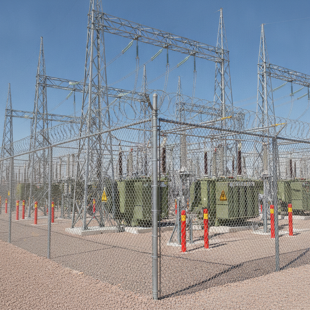
Voltage signs are standardized safety signs that warn people about electrical hazards and high-energy equipment. They use clear symbols, signal words, and colors to reduce shock and arc-flash risk in industrial settings across the USA. Effective voltage signage helps workers, visitors, and contractors recognize danger zones fast and take proper precautions.
By VisionMarker • Last updated: 2026-06-26
Overview and Table of Contents
This complete guide explains what voltage signs are, why they matter, how to choose materials, where to place them, and how to keep them compliant. You’ll get standards-aligned best practices, checklists, tools, and examples tailored for industrial plants, utilities, warehouses, construction, and commercial facilities in the USA.
Use this guide to align your electrical hazard communication program with recognized standards and the realities of busy industrial sites. We draw on VisionMarker’s experience providing ANSI-certified safety signs, labels, stickers, and fire protection signage for demanding environments.
Quick Summary
- Voltage signs communicate electrical hazards with standardized colors, symbols, and signal words.
- Good programs combine signs, labels, barriers, PPE, and procedures into one clear system.
- Material choice (vinyl, aluminum, polycarbonate) affects durability, readability, and service life.
- Placement should match approach paths, viewing distances, and line-of-fire risks.
- Routine inspection and refresh cycles prevent fading, damage, and message drift.
What Are Voltage Signs?
Voltage signs are safety signs that warn about energized equipment and electrical shock or arc-flash hazards. They rely on standardized colors, symbols, and signal words to prompt fast recognition and safe behavior around panels, switchgear, substations, cables, and overhead lines.
In industrial signage, the term “voltage signs” usually covers danger, warning, and caution messages for energized equipment and conductors. The most familiar elements are the lightning bolt symbol, a high-contrast color field, and a clear signal word that matches the severity level of the hazard.
- Signal words and colors: Danger (red/white/black) for immediate severe hazards; Warning (orange/black) for significant risks; Caution (yellow/black) for lower-level hazards that still require care.
- Pictograms: A lightning bolt symbol communicates electrical energy. Additional icons show PPE such as face shields or insulated gloves when needed.
- Message panels: Short, specific text clarifies what to avoid or what PPE to wear. Brevity improves comprehension under stress.
- Arrows/diagrams: Optional directional elements indicate which cabinet or conductor is affected when several sit close together.
Voltage signs sit within the broader “warning sign” family. If you’re standardizing your site visuals, pair them with consistent ANSI Z535-compliant formats for fonts, borders, and layout. This creates pattern recognition that speeds decisions in critical moments.
Why Voltage Signs Matter
Clear voltage signs reduce preventable electrical incidents by prompting the right action at the right time. They help workers recognize energized equipment, respect boundaries, select PPE, and follow lockout/tagout, which collectively lowers shock and arc-flash risk across operations.
Electrical hazards are unforgiving. In busy facilities, the difference between a near-miss and a serious injury often comes down to visual cues noticed in a split second. That’s why consistent voltage signage—supported by barriers, training, and procedures—pays for itself in avoided incidents and downtime.
- Instant recognition: Standard colors and symbols trigger fast responses even for contractors or visitors who don’t know your site.
- PPE alignment: Where arc-flash or shock risk exists, signs can reinforce PPE requirements alongside procedures.
- Wayfinding and boundaries: Mark approach paths and restricted zones so people don’t back into danger while focused on another task.
- Consistency across assets: Align electrical panels, MCCs, substations, and temporary power with one visual language to cut confusion.
We often see improvements when clients pair voltage signs with complementary visuals like floor hazard markings and prohibited area signs. The combination clarifies where to stand, what to touch, and what to avoid.
How Voltage Sign Programs Work
A strong voltage sign program maps hazards, assigns sign types and materials, sets placement and legibility rules, and schedules inspections. It integrates with training, lockout/tagout, and PPE policies so visuals match procedures and real operating conditions.
Effective programs cover people, places, and processes. The best signage doesn’t work alone; it’s coordinated with how your teams approach, energize, de-energize, and maintain equipment.
Core components
- Hazard inventory: List panels, switchgear, transformers, disconnects, overhead lines, and exposed conductors. Note voltage class and live parts exposure.
- Standards mapping: Align formats with recognized signage standards, and match severity to signal words. Keep formats consistent sitewide.
- Material selection: Choose substrates for the environment—UV, moisture, chemicals, and cleaning regimes drive durability.
- Placement rules: Consider approach angles, obstructions, and viewing distances. Define mounting heights and standoff from live parts.
- Inspection cadence: Add signage checkpoints to electrical PMs. Replace faded, peeled, or damaged pieces before legibility drops.
Program flow
- Survey electrical assets and document hazards.
- Choose sign families and sizes that fit distances and mounting constraints.
- Install to a written standard with photos for reference.
- Train teams on meanings, PPE cues, and boundaries.
- Audit quarterly; repair or replace as needed.
In our experience, pairing installation photos with a short checklist cuts future ambiguity when gear is moved, replaced, or upgraded—especially during shutdowns when time is tight.
Types of Voltage Signs and Labels
Voltage hazards are communicated with Danger, Warning, and Caution signs; arc‑flash labels; equipment ID and disconnect markers; temporary tags; and boundary markers. Use the severity level, environment, and viewing distance to pick the right format and size.
Choosing the right type keeps messages crisp and readable. Here are the most common families we supply for electrical work zones and equipment.
Severity-based signs
- Danger – High Voltage: For immediate severe hazards where contact will cause serious injury. Common on switchgear doors and exposed bus areas. See our Danger High Voltage 25 kV product example.
- Warning – Electrical Hazard: For significant risks requiring strong precautions. Often at transformer rooms and MCC entrances.
- Caution – Do Not Touch: For lower-level risks that still merit care, such as control cabinets with de-energized work nearby.
Labels and markers
- Arc‑flash labels: Provide incident energy/category details and PPE guidance where applicable.
- Equipment ID and disconnect markers: Clear naming reduces errors when multiple enclosures sit side by side.
- Temporary energy isolation tags: Support lockout/tagout during maintenance.
Boundary and approach aids
- Restricted/Prohibited area visuals: Reinforce access control alongside locks and barriers; pair with our prohibited area guidance.
- Floor and wall hazard markings: Highlight stand‑off distances; see our hazard markings guide for line styles and colors.
When in doubt between two severity levels, choose the clearer, higher-severity visual if the credible worst case is severe. Clarity beats minimalism when lives and uptime are at stake.
Materials, Sizes, and Durability
Pick materials to match the environment: outdoor UV and weather push you toward aluminum or polycarbonate; indoor clean areas may use laminated vinyl. Size for reading distance and available mounting space so the signal word and symbol are unmistakable.
VisionMarker engineers signage for UV, moisture, and chemical resistance—key for substations, wastewater plants, and outdoor switchyards. The right substrate and protective layers can prevent fading and peeling that undermine legibility and trust.
| Substrate | Best use | Strengths | Considerations |
|---|---|---|---|
| Laminated vinyl | Indoor panels, clean areas | Conforms to surfaces; easy to apply; economical refreshes | Less rigid; protect from abrasion; use rounded corners |
| Aluminum (baked enamel) | Outdoor fences, gates, poles | Rigid; weather/UV resistant; long service life | Requires mechanical fasteners; check for galvanic contact points |
| Polycarbonate/Polyester | Harsh washdowns, chemicals | High impact and chemical resistance; clear graphics | Mind thermal expansion; use appropriate adhesives |
As a rule of thumb for readability, size signal words generously and keep contrast high. Provide at least 1 inch of letter height for every ~25 feet of viewing distance, and use simple, large pictograms. If reflections are an issue, choose matte finishes or reposition the sign.
Placement and Legibility Rules
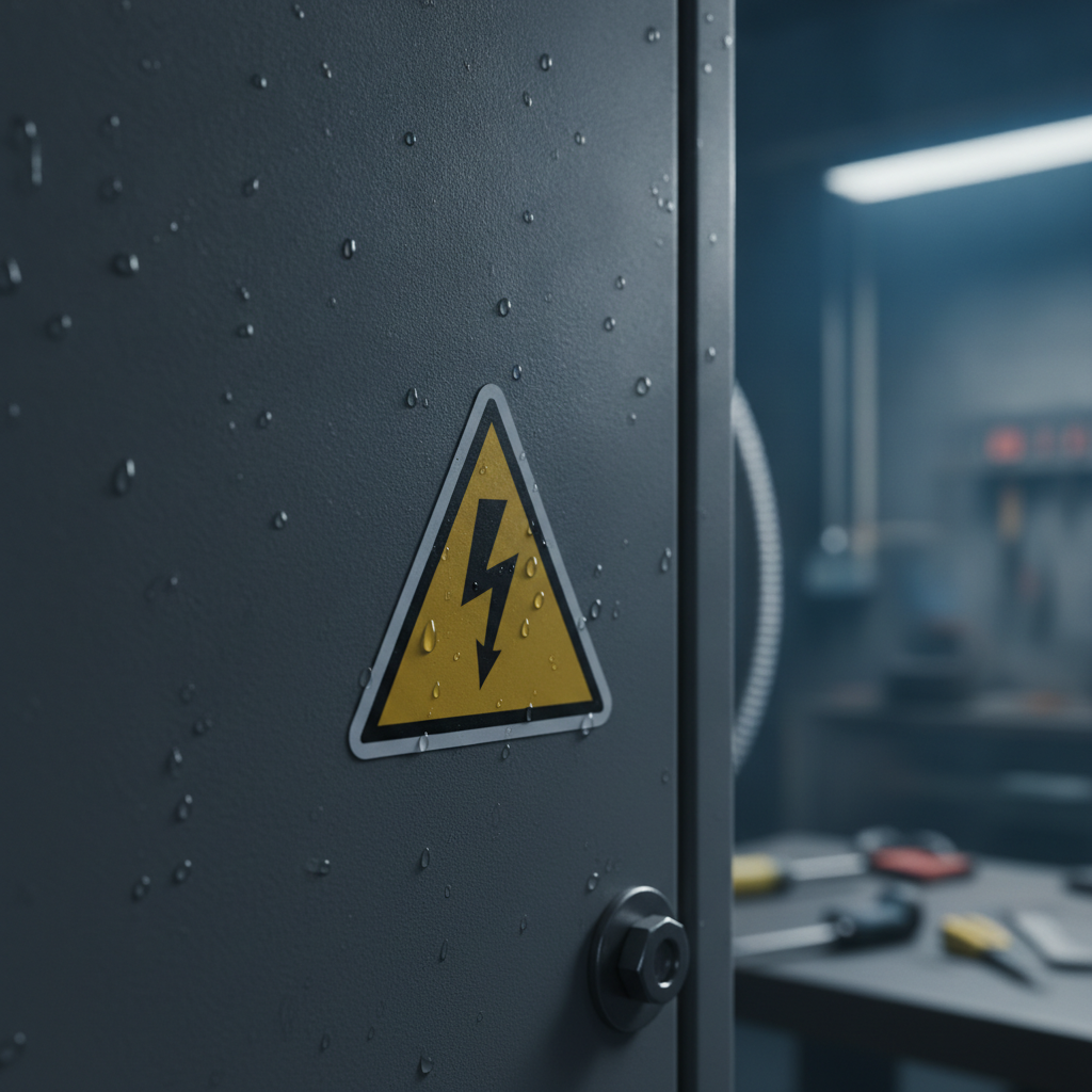
Place voltage signs on the approach path, at decision points, and directly on the hazard. Mount at eye level where possible, avoid obstructions and glare, and size for the actual viewing distance so the symbol and signal word register instantly.
Great content in the wrong place still fails. Walk each approach and ask: “Where will a distracted person look first?” Then position your visuals accordingly.
- Approach-first logic: Post a sign where people first commit to entering a risk zone, then repeat on the equipment.
- Eye-level bias: 57–67 inches from the floor works well for many wall signs; adjust for local obstructions.
- Left-to-right scanning: In the USA, people tend to scan left‑to‑right; place critical visuals where eyes land first.
- Consistent heights: Keep families aligned so pattern recognition kicks in under stress.
Coordinate with complementary assets like ANSI pipe labeling and OSHA-style warnings so visuals don’t compete. Where multiple signs must co-exist, stack by severity and keep spacing tight to read as a single decision unit.
Standards and Alignment
Align voltage signs with widely recognized North American standards for layout, colors, symbols, and signal words. Then mirror those conventions across your facility so workers see the same patterns everywhere, reducing hesitation and error.
Standardization is about faster decisions. While regulations and standards evolve, the underlying principle holds: a consistent visual language lowers cognitive load and error rates.
- Sign format conventions: Use consistent borders, pictograms, and signal word panels as summarized in our ANSI Z535 quick guide.
- Complementary categories: Pair electrical hazard signs with fire protection signage where egress or extinguishing equipment share space.
- Terminology and symbols: Keep phrasing concise; confirm icons are unambiguous for multilingual workforces.
To maintain alignment during expansions or contractor work, include signage specs in your project standards and close-out checklists. Capture photos of compliant installs so future teams know what “right” looks like.
Voltage Signage Best Practices
Treat voltage signage as a living system: survey hazards, install to a written standard, train teams, and audit on a schedule. Use durable materials, high contrast, and clear placement rules; refresh before fading or damage reduces legibility.
Planning and selection
- Inventory all energized assets and approach paths; classify severity.
- Choose sign families and sizes that fit viewing distances and available mounting space.
- Match substrate to environment: UV, moisture, cleaning, and chemicals drive durability.
Installation
- Prep surfaces: remove oils and dust; ensure adhesives meet temperature specs.
- Use mechanical fasteners outdoors; cap edges to limit moisture ingress.
- Photograph final placements for your standards library.
Maintenance and audits
- Fold signage checks into electrical PMs and shutdown plans.
- Replace any sun-faded, peeled, cracked, or obstructed signs immediately.
- Re-check visibility after equipment moves or cable reroutes.
Want a deeper dive on site-wide visual systems? See our primer on marking systems that cut mistakes. Many teams find incidents drop when visuals align with procedures and training.
Tools, Materials, and Resources
Build your kit around reliable substrates, fastening options, and checklists. Pair durable sign materials with surface prep tools, fasteners for outdoor use, and a repeatable audit form so you can maintain compliance without guesswork.
Recommended materials and tools
- Substrates: laminated vinyl for clean interiors; aluminum or polycarbonate outdoors or in washdown/chemical exposure.
- Prep: degreaser, lint-free cloths, isopropyl wipes, edge sealant where needed.
- Fasteners: stainless hardware, rivets, or security screws for gates and poles.
- Measuring aids: viewing distance chart, tape, level, non-contact voltage tester for safe proximity checks.
- Documentation: sign schedule, photos, and a quarterly audit checklist.
Reference context
For process context on electrical maintenance and testing practices that coexist with signage programs, these topical explainers provide helpful overviews of field considerations:
- Switchgear testing and maintenance overview: field testing context.
- Industrial electrical systems background: industrial electrical guide.
- Home-to-facility safety concepts: electrical safety guide (general principles that reinforce signage intent).

Process and Checklists
Standardize your approach with a five-step process: survey, select, install, train, and audit. Use a written standard, photos, and a recurring checklist so improvements stick through turnover, expansions, and shutdown work.
Five-step process
- Survey: Map electrical assets, approach paths, and obstructions; capture photos and distances.
- Select: Choose severity, size, and material based on risk and environment.
- Install: Prep surfaces, mount at eye level where possible, avoid glare, and document placements.
- Train: Teach symbols, signal words, PPE cues, and lockout/tagout reinforcement.
- Audit: Inspect quarterly; replace or relocate as conditions change.
Quick audit checklist
- Is the signal word appropriate for the credible worst case?
- Are the pictograms large, simple, and high-contrast?
- Is the sign visible on approach and at the hazard?
- Any glare, obstructions, or competing visuals?
- Is the substrate intact—no fading, peeling, or cracking?
- Do related floor markings, barriers, and PPE prompts align?
Real-World Examples and Mini Case Studies
Facilities cut incident risk when they treat voltage signs as part of an integrated visual system. These short scenarios show how placement, materials, and consistency change behavior in substations, warehouses, and construction sites.
Utility substation – outdoor exposure
A utility fenced yard had fading gate signs and inconsistent pole markers. We replaced them with rigid aluminum “Danger – High Voltage” panels and durable boundary markers. Visibility improved at 100+ feet and contractors stopped entering the wrong bay—an immediate reduction in near‑miss reports.
Warehouse with mixed vendors
Contractors serviced multiple vendor panels in a busy aisle. We standardized “Warning – Electrical Hazard” signs at consistent heights and added floor stand‑off lines. Forklift operators adjusted routes, and maintenance reported fewer interruptions from foot traffic during energized work.
Construction temporary power
On a multi‑phase build, temporary power cabinets moved weekly. We supplied laminated vinyl signs with rounded corners and a simple relocation standard. The GC used a one‑page checklist to keep signage accurate as power drops moved—preventing “invisible creep” where old signs linger.
VisionMarker supplies ANSI‑certified electrical hazard signs, labels & stickers, and related fire protection signage—engineered for UV, moisture, and chemical resistance. Our team supports fast, professional turnarounds for safety‑critical projects across the USA.
Contact us to align materials, formats, and placements with your facility standards.
Key Takeaways
Treat voltage signage as a system: pick durable materials, place signs where decisions happen, and keep audits routine. Align formats sitewide so workers recognize risks fast and respond with the right PPE and procedures.
- Voltage signs work best as part of an integrated visual program with boundaries and PPE prompts.
- Material and size choices must match environment and viewing distance.
- Consistency accelerates recognition and reduces hesitation under stress.
- Inspections and refresh cycles prevent drift as equipment and layouts change.
Frequently Asked Questions
These answers address common buyer questions about selecting, placing, and maintaining voltage signs in industrial environments. Use them to finalize specs and align stakeholders before ordering.
What should a voltage sign include?
Include the correct signal word (Danger, Warning, or Caution), a clear electrical hazard symbol, concise action text (for example, keep out or PPE required), and high‑contrast colors. Size the sign so it’s readable from the approach distance and mount it where eyes land first.
Where should voltage signs be placed?
Post a sign at the point of decision—before a person enters or touches the hazard—and repeat on the equipment. Aim for eye level, avoid glare and obstructions, and keep similar families at consistent heights to speed recognition.
Which material is best for outdoor high‑voltage areas?
Rigid aluminum or polycarbonate panels perform well outdoors due to UV and weather resistance. Use stainless or security fasteners and check mounts during routine inspections. For chemical exposure or washdowns, polycarbonate and polyester overlays hold up best.
How often should voltage signs be inspected?
Fold signage checks into quarterly electrical PMs. Replace any sign that is faded, peeling, cracked, obstructed, or no longer matches real conditions. Recheck visibility after equipment moves or cable reroutes.
Do voltage signs replace training and procedures?
No. Signs complement training, PPE, and lockout/tagout. They work as fast visual prompts, but safe outcomes depend on procedures and competent workers. Align visuals with your written standards so messages never conflict.